It's a ranking of best posters.
https://sportposterswag.wordpress.c...-com-2016-fbs-football-poster-final-rankings/
https://sportposterswag.wordpress.c...-com-2016-fbs-football-poster-final-rankings/


Follow along with the video below to see how to install our site as a web app on your home screen.
Note: This feature may not be available in some browsers.
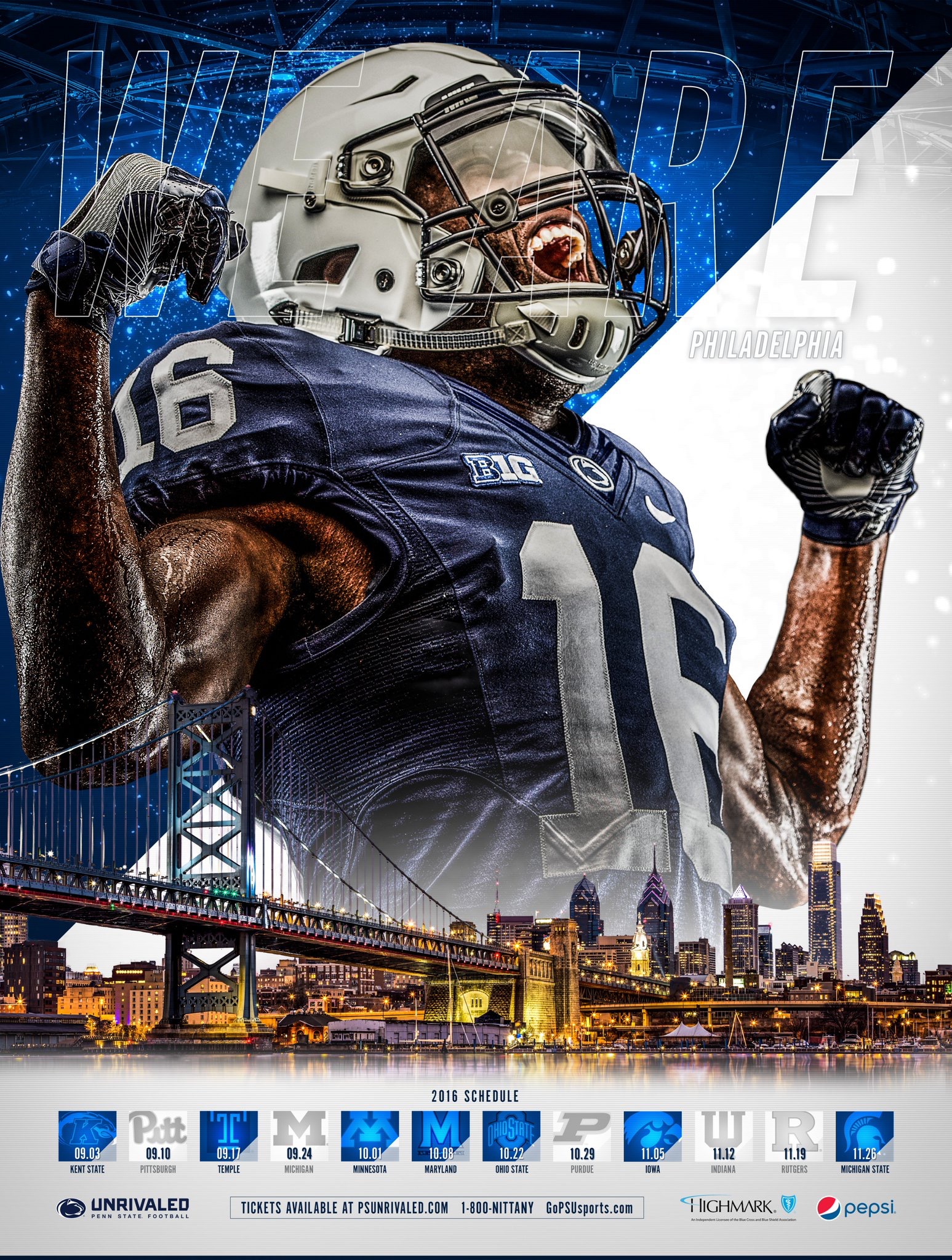
Did Ped State put a background of Philly in their second one? That is laughable.
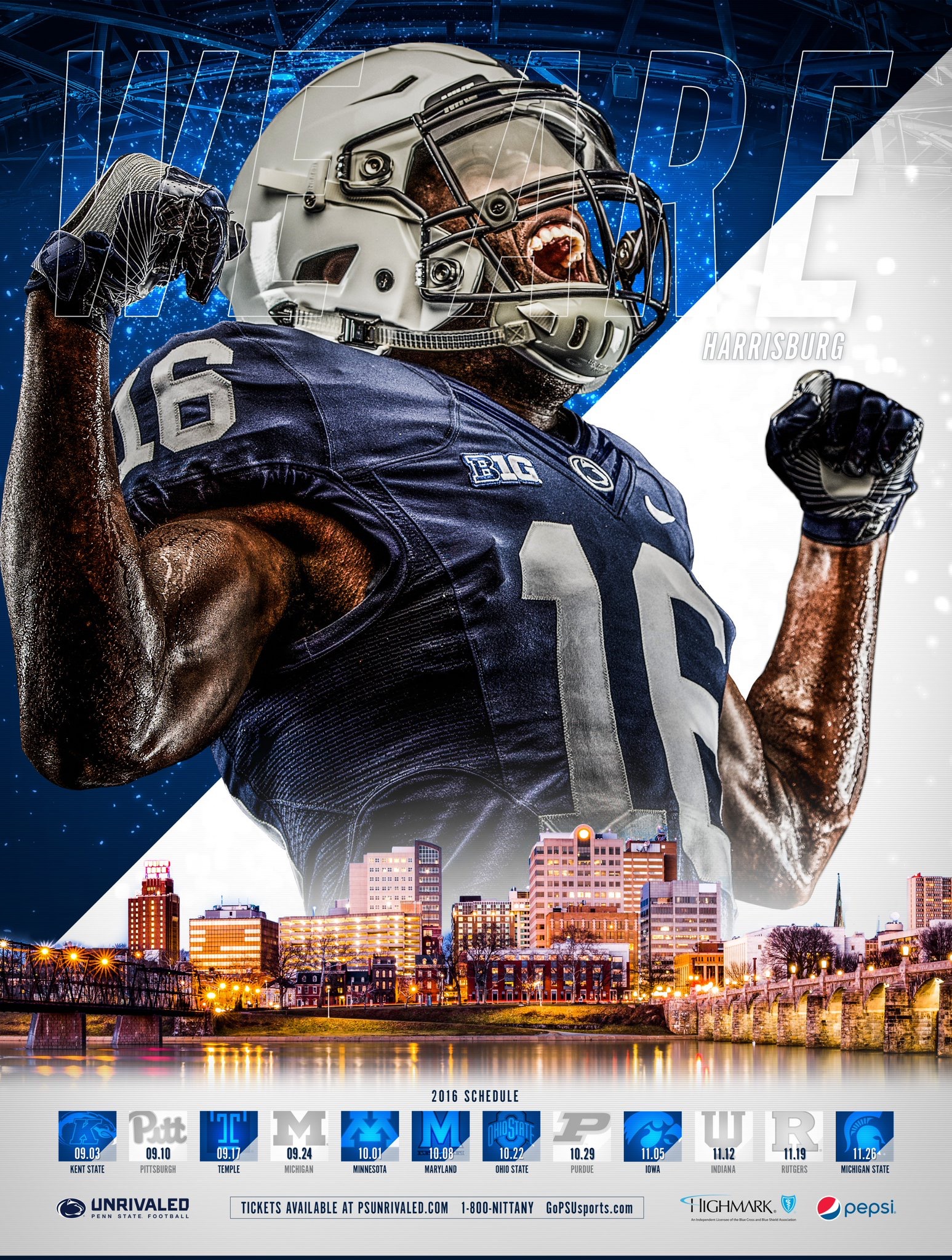
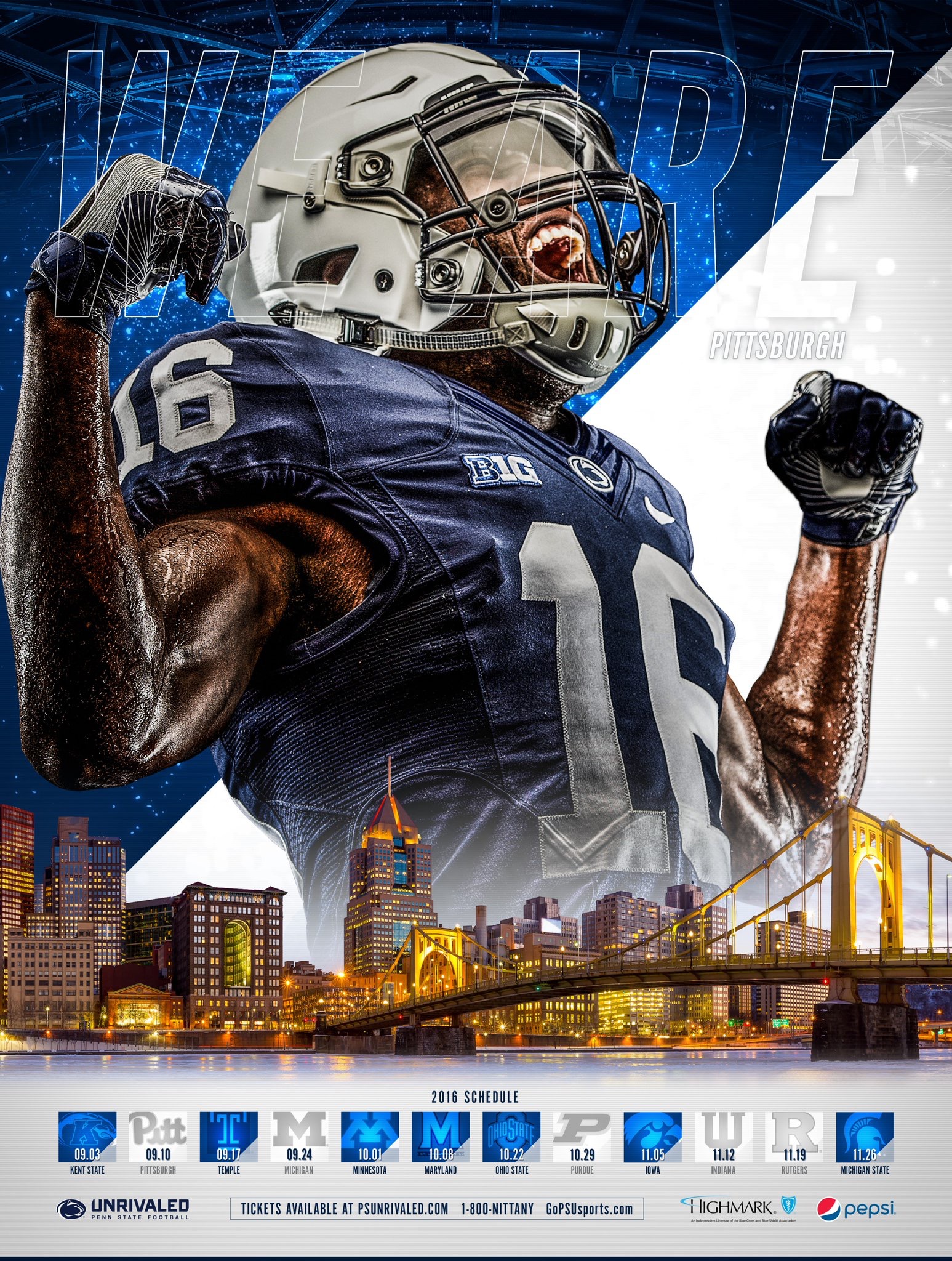
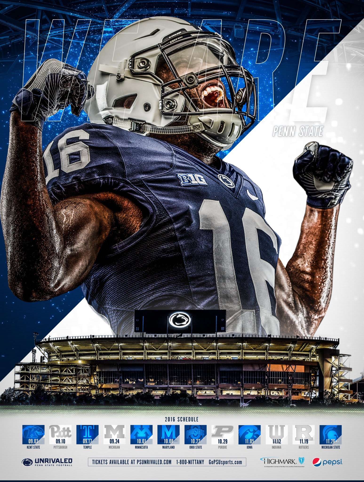
PSU put out four versions of the schedule poster this year, with Beaver Stadium, Philly, Pittsburgh and Harrisburg in the background. Keeping with the theme of STATE university, Dominate the State, or whatever phrase you want to use.
I don't really get the Illinois poster. Don't see how that is #1.PSU put out four versions of the schedule poster this year, with Beaver Stadium, Philly, Pittsburgh and Harrisburg in the background. Keeping with the theme of STATE university, Dominate the State, or whatever phrase you want to use.
Lots of B1G love. But I don't agree at all with Illinois as #1.
Illinois at number 1 is a reasonable choice.Lots of B1G love. But I don't agree at all with Illinois as #1.
The best two i thought were new mexico state and smu. There were at least 30 posters that look exactly the same.
Haha while i dont think theirs in the best its hardly terrible. Its alittle more unique that most of them.Illinois' is terrible.