

Colleges
- AAC
- ACC
- Big 12
- Big East
- Big Ten
- Pac-12
- SEC
- Atlantic 10
- Conference USA
- Independents
- Junior College
- Mountain West
- Sun Belt
- MAC
- More
- Navy
- UAB
- Tulsa
- UTSA
- Charlotte
- Florida Atlantic
- Temple
- Rice
- East Carolina
- USF
- SMU
- North Texas
- Tulane
- Memphis
- Miami
- Louisville
- Virginia
- Syracuse
- Wake Forest
- Duke
- Boston College
- Virginia Tech
- Georgia Tech
- Pittsburgh
- North Carolina
- North Carolina State
- Clemson
- Florida State
- Cincinnati
- BYU
- Houston
- Iowa State
- Kansas State
- Kansas
- Texas
- Oklahoma State
- TCU
- Texas Tech
- Baylor
- Oklahoma
- UCF
- West Virginia
- Wisconsin
- Penn State
- Ohio State
- Purdue
- Minnesota
- Iowa
- Nebraska
- Illinois
- Indiana
- Rutgers
- Michigan State
- Maryland
- Michigan
- Northwestern
- Arizona State
- Oregon State
- UCLA
- Colorado
- Stanford
- Oregon
- Arizona
- California
- Washington
- USC
- Utah
- Washington State
- Texas A&M
- Auburn
- Mississippi State
- Kentucky
- South Carolina
- Arkansas
- Florida
- Missouri
- Ole Miss
- Alabama
- LSU
- Georgia
- Vanderbilt
- Tennessee
- Louisiana Tech
- New Mexico State
- Middle Tennessee
- Western Kentucky
- UTEP
- Florida International University
High School
- West
- Midwest
- Northeast
- Southeast
- Other
- Alaska
- Arizona
- California
- Colorado
- Nevada
- New Mexico
- Northern California
- Oregon
- Southern California Preps
- Washington
- Edgy Tim
- Indiana
- Kansas
- Nebraska
- Iowa
- Michigan
- Minnesota
- Missouri
- Oklahoma Varsity
- Texas Basketball
- Texas
- Wisconsin
- Delaware
- Maryland
- New Jersey Basketball
- New Jersey
- New York City Basketball
- Ohio
- Pennsylvania
- Greater Cincinnati
- Virginia
- West Virginia Preps
ADVERTISEMENT
Install the app
How to install the app on iOS
Follow along with the video below to see how to install our site as a web app on your home screen.
Note: This feature may not be available in some browsers.
You are using an out of date browser. It may not display this or other websites correctly.
You should upgrade or use an alternative browser.
You should upgrade or use an alternative browser.
One thing I hate about NCAA tourney...
- Thread starter superfan01
- Start date

Not sure what you are referring to.is that they put down the same generic floor at every venue. Hate that a game at the garden has this floor on it. Feels so unnatural watching a game at MSG like that. You can't tell a difference where there playing.
The courts are different from the courts in rounds one and two. That was the first thing I noticed on Thursday.
Those courts had a different mid court logo and more color along the baselines.
The courts for the first four games were different from the courts for the regional semifinals and finals.
The court for the final four will also be different.
Could've had a KFC in the center, Knicks-Florida-Carolina. Coordinate with a commercial and bingo.is that they put down the same generic floor at every venue. Hate that a game at the garden has this floor on it. Feels so unnatural watching a game at MSG like that. You can't tell a difference where there playing.
01 once again shows why he is clueless when it comes to bball.
I heard he was rooting hard for the cocks today too.
I heard he was rooting hard for the cocks today too.
is that they put down the same generic floor at every venue. Hate that a game at the garden has this floor on it. Feels so unnatural watching a game at MSG like that. You can't tell a difference where there playing.
I kind of agree though that they could have made an exception for MSG since it is so iconic and used the signature floor design with the NCAA regional logos, etc.
I dunno, I've been to a game and I've been to a concert in MSG and I didn't feel like I was anyplace special or iconic despite all of the basketball history there.I kind of agree though that they could have made an exception for MSG since it is so iconic and used the signature floor design with the NCAA regional logos, etc.
I think that applies mainly to people from that area.
I guess the NCAA heard you. The court for the NIT final four looks close to the normal MSG court.
I think the optics were better during the NCAA Tournament (the court, media seating, tournament decorations etc) but for those that think MSG is special the NIT set up probably looks better.
I think the optics were better during the NCAA Tournament (the court, media seating, tournament decorations etc) but for those that think MSG is special the NIT set up probably looks better.
I thought for sure the topic would be no Dickie Vee on broadcasts, or former pro players only getting involved with college ball during the Big Dance on TV, or "personalities" enriching themselves with commercials and college players enriching themselves with the glory.
No Dick Vitale is the BEST thing about the NCAA Tournament. Definitely not something to hate the tournament for
When I think of problems with the NCAA tournament game floors, I think of the whole "Let add NJ to the Block R so everyone watching knows Rutgers is in NJ." thing....
http://blog.nj.com/ledgerupdates/2007/05/lawmakers_vote_to_urge_rutgers.html
http://blog.nj.com/ledgerupdates/2007/05/lawmakers_vote_to_urge_rutgers.html
Just shade the center court wood in the shape of NJ with the Block R in it.
Texas, Texas A&M, Texas Tech, UNC, Ohio State do something similar and it's already obvious what states those schools are in.
Texas, Texas A&M, Texas Tech, UNC, Ohio State do something similar and it's already obvious what states those schools are in.
Except we've been selling ourselves as the the "New York" major college program for the past 15 years. We try to sell ourselves as the state school when it serves our purposes locally (i.e. NJ Recruiting, Fan & Financial support) but the brand we've been selling to the Big Ten and the nation is that we represent the NYC market not just the punchline that "Jersey" represents. The NJ logo on the a court visible to the nation represents a mixed message. Not saying I'm opposed to the NJ outline but I think understand why it's not there and why you don't see New Jersey in the foootball end zone anymore.
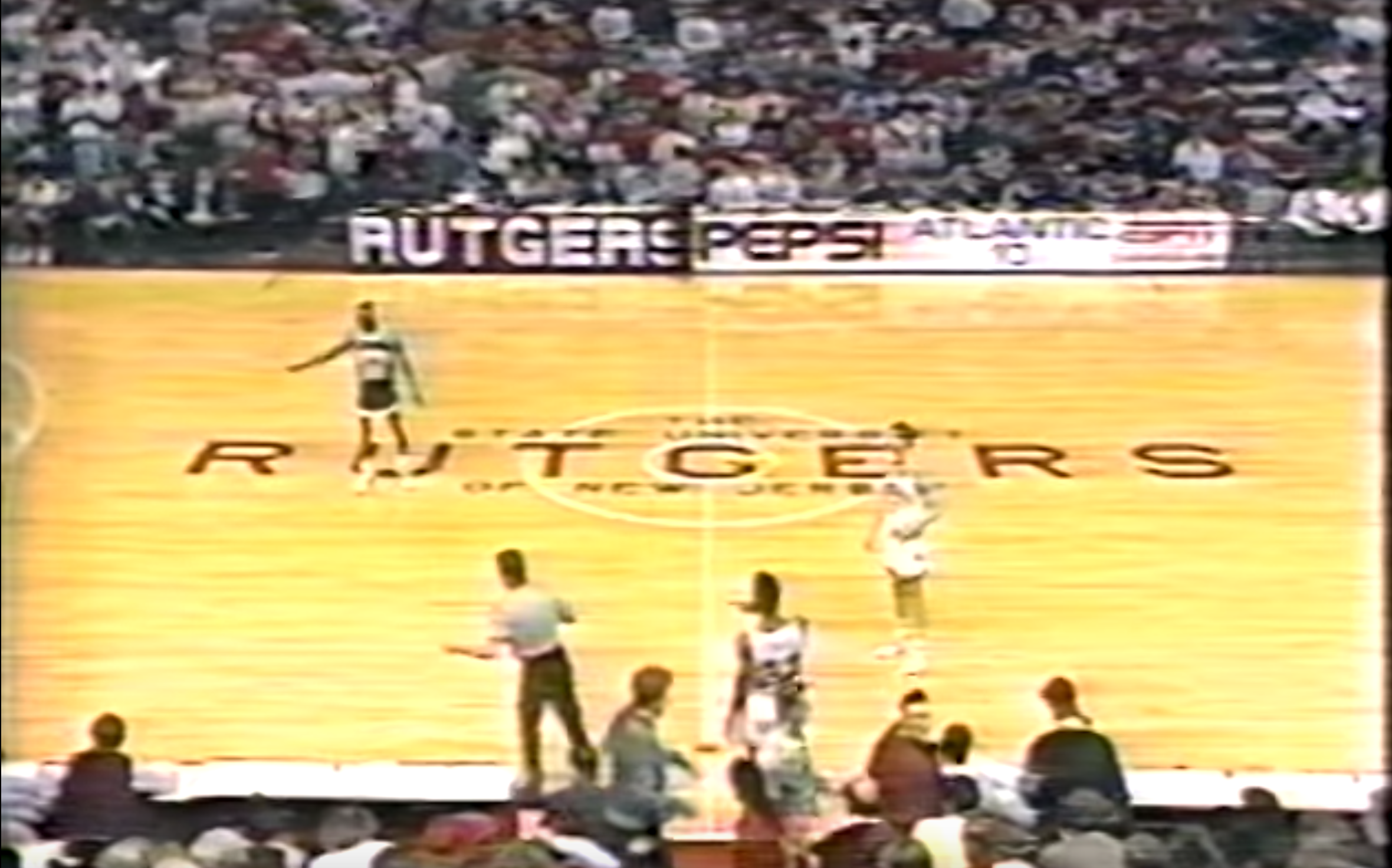
There was nothing worse in the history of basketball floors than our late-1980s "The State University of New Jersey" written in black letters at midcourt. Really? We have to explain this? "RUTGERS" was also spelled out all the way across the floor. Awful. That's for baselines.
I am all for a New Jersey outline at midcourt. Texas A&M does the state outline particularly well, I think. Just a darker shade of the floor color, almost elegant looking. Not a big white splotch like Indiana. The R superimposed on a similar outline would be fine.
No more words. Ever. (I feel like Joan Crawford yelling about wire hangers.) "RUTGERS" is sufficient. They'll figure out what -- and where -- we are if they haven't already.
And if we've been selling ourselves as the "New York" college program, I haven't noticed. And that's silly. We're not. We bring a good chunk of the New York market because Northern New Jersey is a huge chunk of that market. End of conversation.
There was nothing worse in the history of basketball floors than our late-1980s "The State University of New Jersey" written in black letters at midcourt. Really? We have to explain this? "RUTGERS" was also spelled out all the way across the floor. Awful. That's for baselines.
.
Yea, I noticed that the other day when watching RU-PSU a10 final highlights. It is almost exactly what UB tried to do for about the past 5 years. For the record, they finally gave up on becoming "New York" and just came out with a new Buffalo head logo and their "UB" logo.

Similar threads
- Replies
- 17
- Views
- 609
- Replies
- 24
- Views
- 1K
- Replies
- 17
- Views
- 830
- Replies
- 53
- Views
- 2K
ADVERTISEMENT
ADVERTISEMENT