
I sure hope not, I think gray uniforms look terrible, and I don't understand why you need more than two uniforms.Anyone else see the new helmet? Gray helmet with silver new Knight logo ... I think with the gray cleats, we will have an all-gray uniform like the other adidas schools have had.
OURS:
Ville

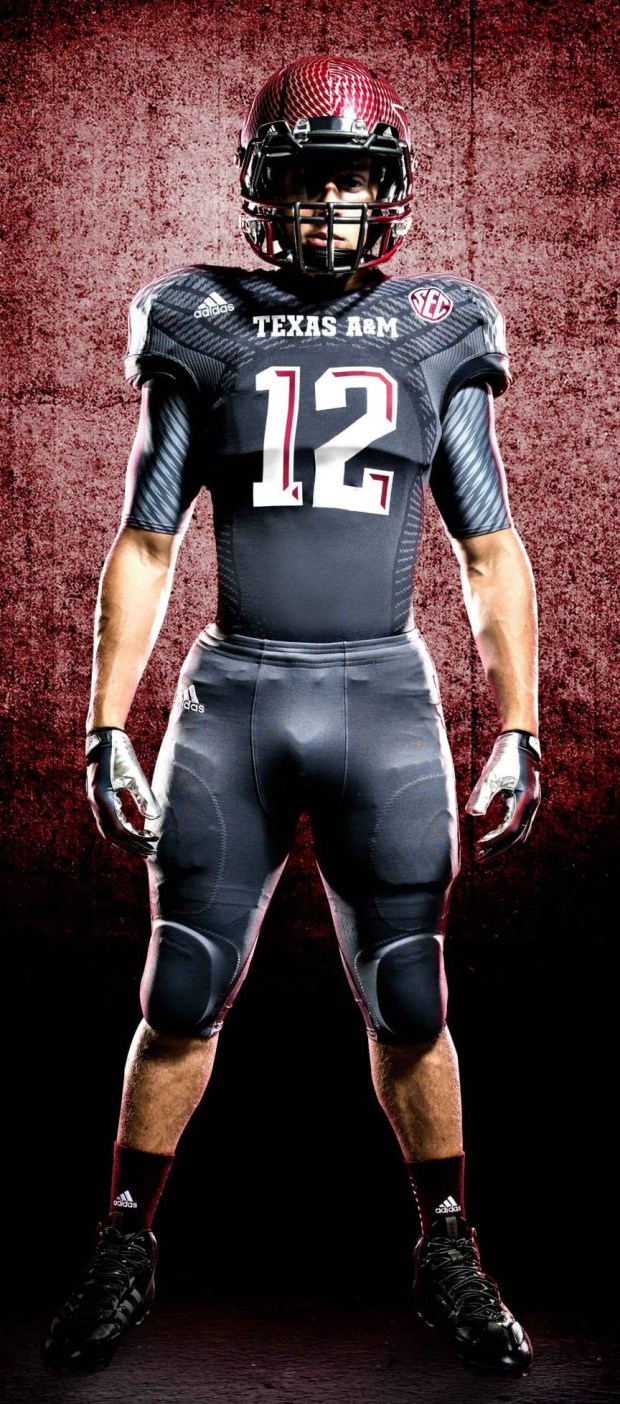
A&M
Tenn

I think those would look fine if they got rid of the stupid tire tread marks or whatever that is supposed to be all over the orange jersey. They look like they got run over by a truck.That is NOT what they are wearing now.
This is what Adidas made for them going forward...
http://www.miamiherald.com/sports/college/acc/university-of-miami/article102681277.html