

Colleges
- American Athletic
- Atlantic Coast
- Big 12
- Big East
- Big Ten
- Colonial
- Conference USA
- Independents (FBS)
- Junior College
- Mountain West
- Northeast
- Pac-12
- Patriot League
- Pioneer League
- Southeastern
- Sun Belt
- Army
- Charlotte
- East Carolina
- Florida Atlantic
- Memphis
- Navy
- North Texas
- Rice
- South Florida
- Temple
- Tulane
- Tulsa
- UAB
- UTSA
- Boston College
- California
- Clemson
- Duke
- Florida State
- Georgia Tech
- Louisville
- Miami (FL)
- North Carolina
- North Carolina State
- Pittsburgh
- Southern Methodist
- Stanford
- Syracuse
- Virginia
- Virginia Tech
- Wake Forest
- Arizona
- Arizona State
- Baylor
- Brigham Young
- Cincinnati
- Colorado
- Houston
- Iowa State
- Kansas
- Kansas State
- Oklahoma State
- TCU
- Texas Tech
- UCF
- Utah
- West Virginia
- Illinois
- Indiana
- Iowa
- Maryland
- Michigan
- Michigan State
- Minnesota
- Nebraska
- Northwestern
- Ohio State
- Oregon
- Penn State
- Purdue
- Rutgers
- UCLA
- USC
- Washington
- Wisconsin
High School
- Illinois HS Sports
- Indiana HS Sports
- Iowa HS Sports
- Kansas HS Sports
- Michigan HS Sports
- Minnesota HS Sports
- Missouri HS Sports
- Nebraska HS Sports
- Oklahoma HS Sports
- Texas HS Hoops
- Texas HS Sports
- Wisconsin HS Sports
- Cincinnati HS Sports
- Delaware
- Maryland HS Sports
- New Jersey HS Hoops
- New Jersey HS Sports
- NYC HS Hoops
- Ohio HS Sports
- Pennsylvania HS Sports
- Virginia HS Sports
- West Virginia HS Sports
ADVERTISEMENT
Install the app
How to install the app on iOS
Follow along with the video below to see how to install our site as a web app on your home screen.
Note: This feature may not be available in some browsers.
You are using an out of date browser. It may not display this or other websites correctly.
You should upgrade or use an alternative browser.
You should upgrade or use an alternative browser.
Throwback to the 2012 Uniform Release
- Thread starter 1766Athletics
- Start date

Wow, they were awful back then and somehow look even worse now.Terrible
These unis could’ve worked if Rutgers were allowed to mix and match. But Nike didn’t allow Flood to do that, which was why that always went All Salmon, All White, or All Black.
These unis could’ve worked if Rutgers were allowed to mix and match. But Nike didn’t allow Flood to do that, which was why that always went All Salmon, All White, or All Black.
Only way they would work is with gasoline and a match...
I mostly don't care about uniforms. But those salmon ones made it extremely difficult to read the numbers in the stadium. Which was annoying. Who designs uniforms with hard to read numbering? And who accepts them?Only way they would work is with gasoline and a match...
The beginning of some dark times for RU football.
I just threw up in my mouth
If memory serves me correct, wasn’t Gregg behind this? Or at least supporting it.?
If memory serves me correct, wasn’t Gregg behind this? Or at least supporting it.?
The 2006 unis do it for me. I really don't care for the font of our current uniforms.The All White uniform looked good.
Click here for an example of the 2006 home unis...
2006 road.... https://www.nj.com/resizer/v2/https...84f642a4873b890538f36f2&width=1280&quality=90
Last edited:
06 uni’s were near perfectionThe 2006 unis do it for me. I really don't care for the font of our current uniforms.
The 2006 unis do it for me. I really don't care for the font of our current uniforms.
Click here for an example of the 2006 home unis...
2006 road.... https://www.nj.com/resizer/v2/https://advancelocal-adapter-image-uploads.s3.amazonaws.com/image.nj.com/home/njo-media/width2048/img/rutgers_football/photo/24758779-standard.jpg?auth=f0e03f33807a44e9124c894c353bf88bad12f05e484f642a4873b890538f36f2&width=1280&quality=90
Best
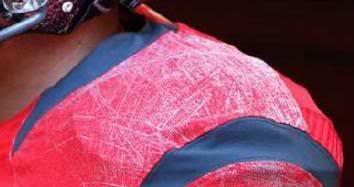
Those battlescarred helmets were great and should be used on occasion. They were specially made by Hydro Graphics, Inc. (HGI).


True story ...
I once had my account banned on this very message board forum by the previous ownership/management (who totally never played favorites) because I posted a photoshop of Schiano coaching in red pajamas in my signature file and refused to take it down. The forum intelligentsia at the time had a meltdown because nobody was allowed to make fun of our Salmon Jammies.
Also, the Hog Boys loved our chrome helmets ...
Last edited:
I always liked the idea of the old school pat patriot uniforms repurposed with a Betsy Ross block R on the helmet. The scarlet knight on horseback and the revolutionary war era soldiers are conflicting too many different time periods for me 🤣. Rutgers’/New Jersey’s historical significance is not something many can claim in college sports.
I honestly like the 2019 Adidas uniforms the best.
Clean and classic Big 10:

 www.nj.com
Clean and classic Big 10:
Rutgers hanging tough: Rutgers vs. Penn State LIVE SCORE UPDATES and STATS | College Football Scores Week 14
The Rutgers Scarlet Knights (2-9) meet the No. 10 ranked Penn State Nittany Lions (9-2) in Rutgers' season finale on Saturday, November 30, 2019 (11/30/19) at Beaver Stadium in University Park, Pennsylvania. While Rutgers awaits word on whether Greg Schiano will return as coach amid tumultuous...
awful and whoever approved should have been fired lol
The all whites with chrome did not suck.
Anything with that salmon color sucked.
Anyone remember the foolish argument that the uniforms used the official Pantone color defined in some official Rutgers style guide? There were 2 things wrong with that..
1) The color was chosen for print purposes because a bright scarlet red on bright white paper is unreadable.. same for bright white lettering on bright scarlet red on signage.
2) the silver/gray score marks on the shoulders and numbers and letters serve to BLEND the gray and red thereby making the salmon look.. and that doesn't even consider the color of the light from the sun, clouds or stadium lights. But this si why the all-whites worked... the silver/gray was dark enough to see against the bright white.. and even if it blended a little bit it still showed as white.
As for "approval" of the unis... contracts for support from Nike were probably mostly to blame. There has to be some pressure to change things, shake things up.. sell more new and different "official" products. We might have more say in the matter with Adidas... though I suspect there is competition among the big Ten's many red and white schools to not have too-similar looking colors and uniforms. Any conflicts probably go the way of the more valuable contract.. more valuable to Addidas.
- Big Ten
- Nike: 50% (Illinois, Iowa, MSU, Minnesota, Ohio State, Oregon, Penn State, Purdue, USC)
- Jordan: 11.1% (Michigan, UCLA)
- Adidas: 22.2% (Indiana, Nebraska, Rutgers, Washington)
- Under Armour: 16.7% (Maryland, Northwestern, Wisconsin)
Last edited:
The chrome helmets were cheesy as hell. The only uniform combo that was acceptable in that era was the white ones with white helmets.
Those are my favorite as well, but I do like how the RUTGERS across the front on the current jerseys is at least the same font as the block R. I wish we could have that wordmark with the old block numbers from 2006.The 2006 unis do it for me. I really don't care for the font of our current uniforms.
Click here for an example of the 2006 home unis...
2006 road.... https://www.nj.com/resizer/v2/https://advancelocal-adapter-image-uploads.s3.amazonaws.com/image.nj.com/home/njo-media/width2048/img/rutgers_football/photo/24758779-standard.jpg?auth=f0e03f33807a44e9124c894c353bf88bad12f05e484f642a4873b890538f36f2&width=1280&quality=90
My eyesight was much better 12 yrs. ago and I still couldn't read the numbers.
Imagine the uproar on these boards if the Chrome Dome and Salmon Jerseys were made by Adidas!!!Damn, I forgot we were a Nike school at one point...
The chrome battle scares with a Scarlet R are pretty dope in my opinion.
Ugly is ugly no whose name is associated with it.Imagine the uproar on these boards if the Chrome Dome and Salmon Jerseys were made by Adidas!!!
That is true. But this pro Nike place would’ve gone APE 💩!!! if it was Adidas who made those unis.Ugly is ugly no whose name is associated with it.
Similar threads
- Replies
- 41
- Views
- 1K
- Replies
- 5
- Views
- 392
- Replies
- 11
- Views
- 811
- Replies
- 6
- Views
- 596
- Replies
- 2
- Views
- 182
ADVERTISEMENT
ADVERTISEMENT