

Colleges
- American Athletic
- Atlantic Coast
- Big 12
- Big East
- Big Ten
- Colonial
- Conference USA
- Independents (FBS)
- Junior College
- Mountain West
- Northeast
- Pac-12
- Patriot League
- Pioneer League
- Southeastern
- Sun Belt
- Army
- Charlotte
- East Carolina
- Florida Atlantic
- Memphis
- Navy
- North Texas
- Rice
- South Florida
- Temple
- Tulane
- Tulsa
- UAB
- UTSA
- Boston College
- California
- Clemson
- Duke
- Florida State
- Georgia Tech
- Louisville
- Miami (FL)
- North Carolina
- North Carolina State
- Pittsburgh
- Southern Methodist
- Stanford
- Syracuse
- Virginia
- Virginia Tech
- Wake Forest
- Arizona
- Arizona State
- Baylor
- Brigham Young
- Cincinnati
- Colorado
- Houston
- Iowa State
- Kansas
- Kansas State
- Oklahoma State
- TCU
- Texas Tech
- UCF
- Utah
- West Virginia
- Illinois
- Indiana
- Iowa
- Maryland
- Michigan
- Michigan State
- Minnesota
- Nebraska
- Northwestern
- Ohio State
- Oregon
- Penn State
- Purdue
- Rutgers
- UCLA
- USC
- Washington
- Wisconsin
High School
- Illinois HS Sports
- Indiana HS Sports
- Iowa HS Sports
- Kansas HS Sports
- Michigan HS Sports
- Minnesota HS Sports
- Missouri HS Sports
- Nebraska HS Sports
- Oklahoma HS Sports
- Texas HS Hoops
- Texas HS Sports
- Wisconsin HS Sports
- Cincinnati HS Sports
- Delaware
- Maryland HS Sports
- New Jersey HS Hoops
- New Jersey HS Sports
- NYC HS Hoops
- Ohio HS Sports
- Pennsylvania HS Sports
- Virginia HS Sports
- West Virginia HS Sports
ADVERTISEMENT
Install the app
How to install the app on iOS
Follow along with the video below to see how to install our site as a web app on your home screen.
Note: This feature may not be available in some browsers.
You are using an out of date browser. It may not display this or other websites correctly.
You should upgrade or use an alternative browser.
You should upgrade or use an alternative browser.
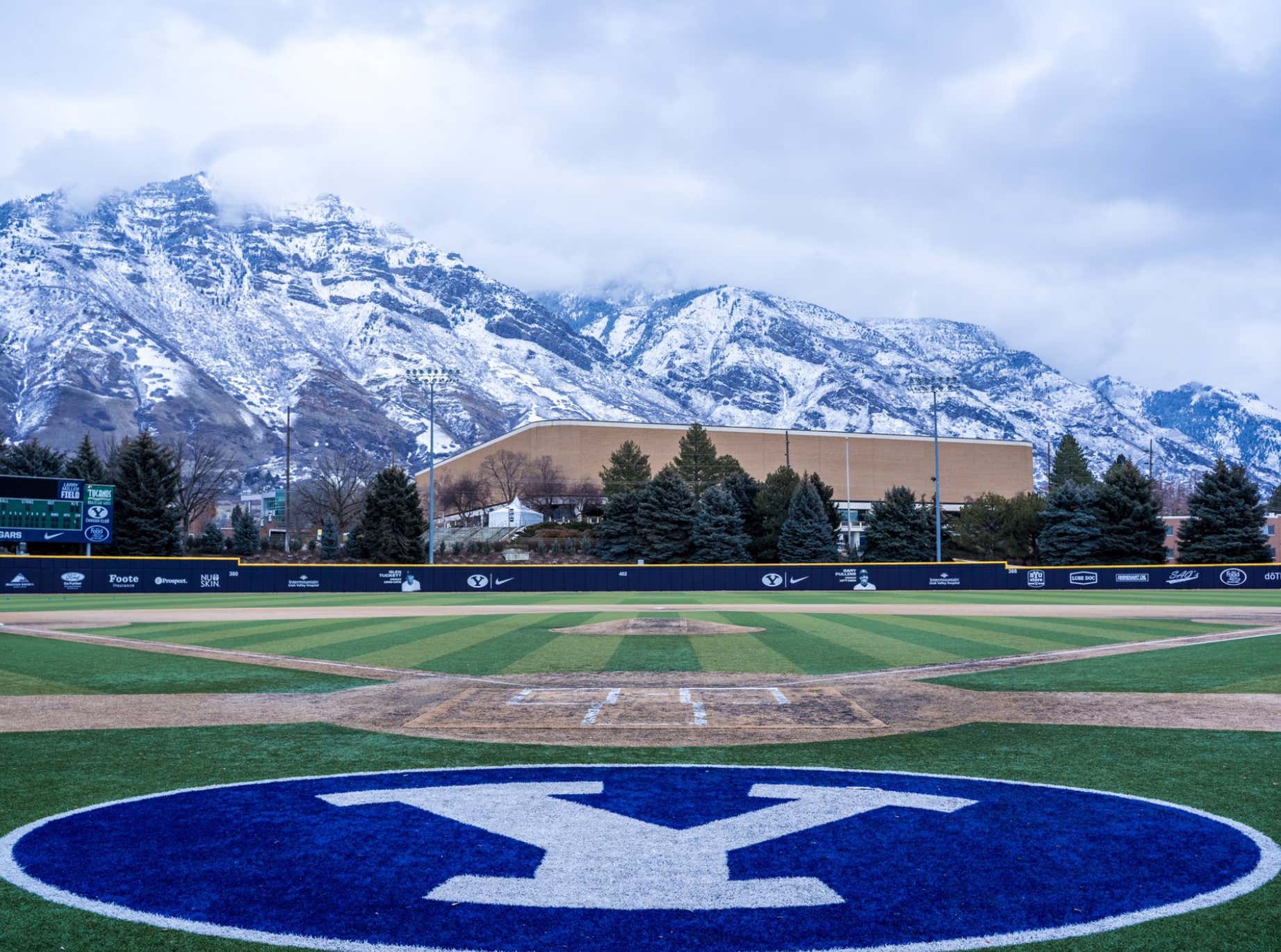
OT: Field Porn…most beautiful field images.
- Thread starter BROTHERSKINNY
- Start date

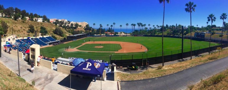
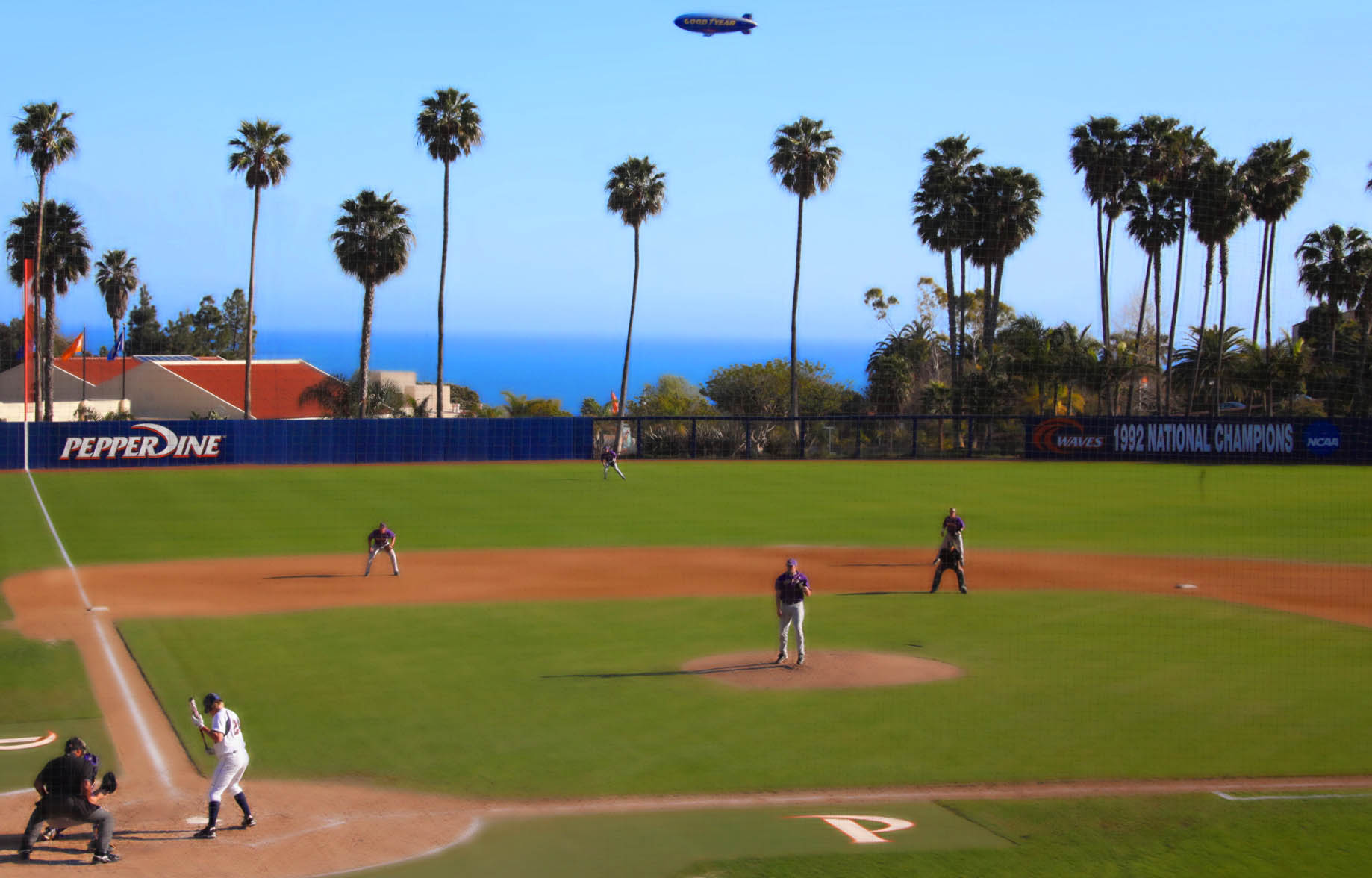
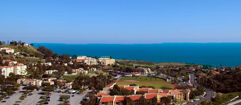
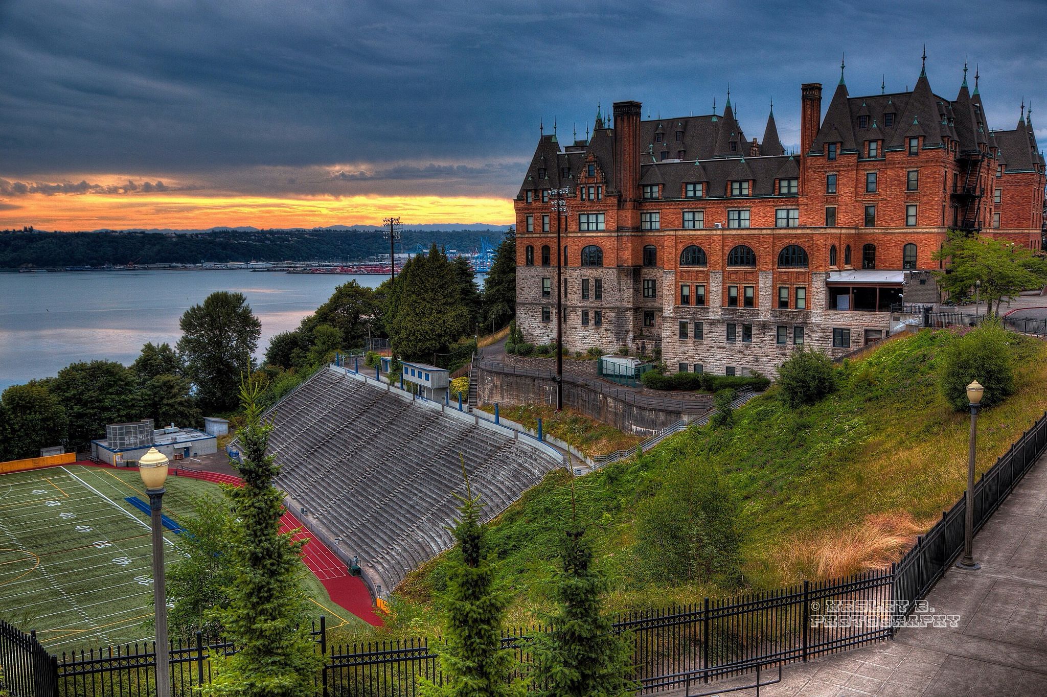
ahhh the site of Battle of the Network StarsPepperdine... right on the shores of Malibu
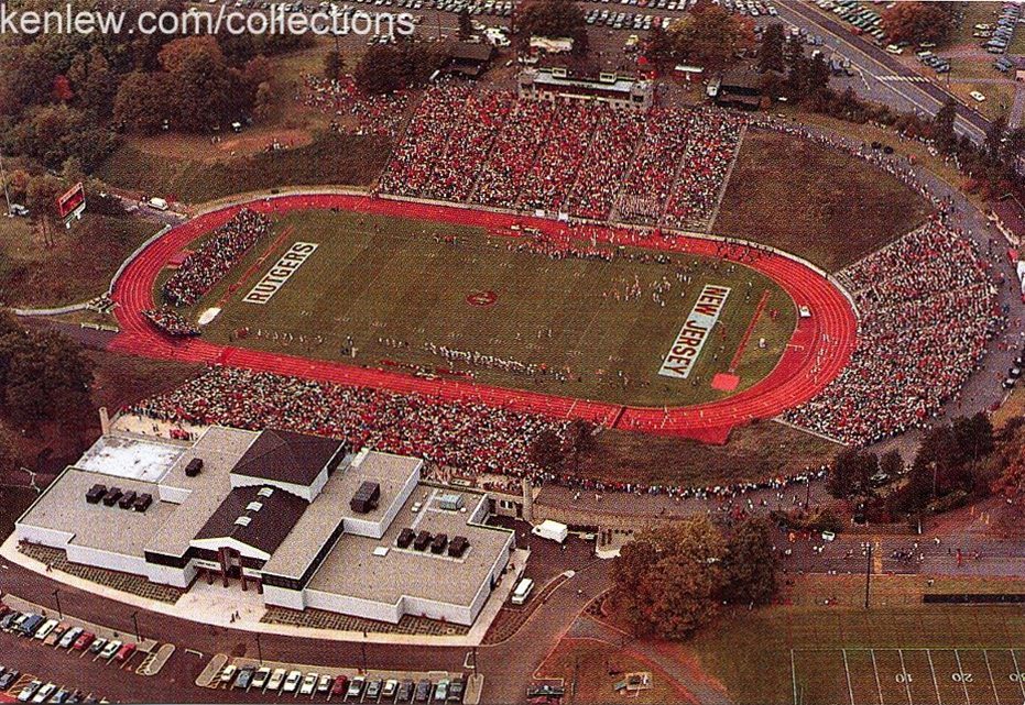
Ok, I bleed scarlet as much as anyone but that overhead shot isn't quite as picturesque as the rest. It scores points because it's Rutgers, but the thin brown river, sporadic trees, insignificant landscape doesn't quite inspire awe.

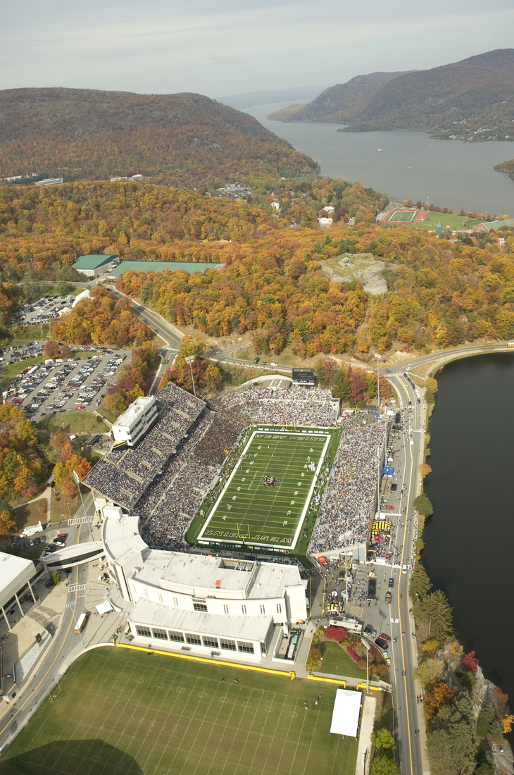
The place is getting a much needed renovation. The reservoir side is getting rebuilt. Right now you can
hardly make out the seating letters/numbers - paint peeling everywhere - its a real dump in a lot of ways
PRESERVATION PROJECT
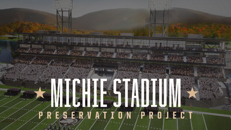
Michie Stadium Preservation Project
 www.michiestadium.com
I'm guessing that was from the last home game against WVU in 1992. Construction crews were on site the very next day to start the new stadium. Rutgers gets a rare win against West Virginia in what they called it R House.
No. Clifford Scott was in East Orange. I believe it was combined with East Orange High to form East Orange Campus, possibly on the former site of Upsula College.
I believe Shabazz, which is in Newark, was originally called South Side High School.
Pretty sure it's been called Shabazz since before the 90's
Sarcasm?? Sporadic trees? Insignificant landscape? There is a golf course right next to the stadium, a river + canal, tons of trees. Look at 2 of our closest rivals in the Big 10. Penn State sucks and Maryland is a series of paved small parking lots.Ok, I bleed scarlet as much as anyone but that overhead shot isn't quite as picturesque as the rest. It scores points because it's Rutgers, but the thin brown river, sporadic trees, insignificant landscape doesn't quite inspire awe.
Name the Movie that filmed at this high school.
I would have guessed Harry Potter.
Correct on all points. The "campus" in East Orange Campus is a homage of sorts to Upsala.No. Clifford Scott was in East Orange. I believe it was combined with East Orange High to form East Orange Campus, possibly on the former site of Upsula College.
I believe Shabazz, which is in Newark, was originally called South Side High School.
In fact, when we played at Clifford Scott in the mid-'80s, we played them at Upsala. I forget if it has closed yet.
I'm not sure when South Side became Shabazz, but one famous South Side alum is former NYC mayor Ed Koch.
I didn't realize Connecticut had mountains like that. 😉
South Side HS changed the name to Malcolm X Shabazz HS in 1972Pretty sure it's been called Shabazz since before the 90's
how about this one.. any awe?Ok, I bleed scarlet as much as anyone but that overhead shot isn't quite as picturesque as the rest. It scores points because it's Rutgers, but the thin brown river, sporadic trees, insignificant landscape doesn't quite inspire awe.
yes.. they had a real chance with building that south entrance to do something really good.. they messed it up badly. Its almost like they used whatever materials they had around and cobbled it together.
Do many people use that entrance?how about this one.. any awe?
yes.. they had a real chance with building that south entrance to do something really good.. they messed it up badly. Its almost like they used whatever materials they had around and cobbled it together.
Scuba divers.Do many people use that entrance?
What did you want to do there? They shouldn't wasted money putting an entrance as it's hardly ever used.how about this one.. any awe?
yes.. they had a real chance with building that south entrance to do something really good.. they messed it up badly. Its almost like they used whatever materials they had around and cobbled it together.
And as time goes by and more money becomes available it will be more of utility type entrance with the locker rooms and whatever else gets built under the Student Section.What did you want to do there? They shouldn't wasted money putting an entrance as it's hardly ever used.
If I have to explain the joke, then it was a failed joke. 😕
I'll do better next time.
choices made in materials and alignments are very disjointed.. much like a good chunk of the Rodkin building.. lack of symmetry and proportion everywhere. You guys always defend these choices by citing budgets when it has nothing to do with budget but DESIGN.What did you want to do there? They shouldn't wasted money putting an entrance as it's hardly ever used.
Hey @Source , any chance you know how to find the original plans for the south entrance? I am wondering if it looked better in the plans.
Last edited:
Seriously? Again what did you want it to be a grand palace? There is nothing wrong with it.choices made in materials and alignments are very disjointed.. much like a good chunk of the Rodkin building.. lack of symmetry and proportion everywhere. You guys always defend these choices by citing budgets when it has nothing to do with budget but DESIGN.
Your first complaint was about "materials" now it's about design. Make up your mind. The field entrance for emergency vehicles mandated, under any design, there was no chance for perfect symmetry in that end of the building. Some of the original design was for other functions underneath that were cut for budget reasons. And if you think that a complete redesign wouldn't cost money than you are a fool.
what.. both cannot be faulty? It's the way you use materials that makes the main difference. I made lengthy comments about both buildings when they were new I will not go trudge them up just to answer you. The inside space is not even a factor.Seriously? Again what did you want it to be a grand palace? There is nothing wrong with it.
Your first complaint was about "materials" now it's about design. Make up your mind. The field entrance for emergency vehicles mandated, under any design, there was no chance for perfect symmetry in that end of the building. Some of the original design was for other functions underneath that were cut for budget reasons. And if you think that a complete redesign wouldn't cost money than you are a fool.
You disagree.. fine. But click that link to see where I am coming from. it costs virtually nothing to employ symmetry and proportion properly. In materials, it is clashing warm brick or wood and cold glass and metal that CAN be disjointed.
Aesthetics and Architecture
I'm not saying it's not better than PSU or Maryland... it is. It's just not awe inspiring like you see at BYU or Colorado.Sarcasm?? Sporadic trees? Insignificant landscape? There is a golf course right next to the stadium, a river + canal, tons of trees. Look at 2 of our closest rivals in the Big 10. Penn State sucks and Maryland is a series of paved small parking lots.
Don't get me wrong, I love our stadium, the fact that it's built into the hill, the quaintness of the campus side, the new facade of the River Rd side, I just don't think it belongs on any top 10 lists.
I don't think any P5 schools stadiums belong in the top 10.I'm not saying it's not better than PSU or Maryland... it is. It's just not awe inspiring like you see at BYU or Colorado.
Don't get me wrong, I love our stadium, the fact that it's built into the hill, the quaintness of the campus side, the new facade of the River Rd side, I just don't think it belongs on any top 10 lists.
I've been all over this country watching college football and am a proud of the setup and beauty of the surrounding lots as a Rutgers alum. We don't take a back seat to many major programs.
I get what your saying but stop with "it wouldn't have cost more money" to build a palace for an entrance that nobody uses.what.. both cannot be faulty? It's the way you use materials that makes the main difference. I made lengthy comments about both buildings when they were new I will not go trudge them up just to answer you. The inside space is not even a factor.
You disagree.. fine. But click that link to see where I am coming from. it costs virtually nothing to employ symmetry and proportion properly. In materials, it is clashing warm brick or wood and cold glass and metal that CAN be disjointed.
Aesthetics and Architecture
You keep ignoring that the south end zone and expansion was an add on not the original design. You keep forgetting that funding was cut drastically after they committed to the addition. An addition that was never really needed. You seem to be saying it's a dump. It's not.
BTW I graduated with a degree in Urban and Regional Planning and had many architecture classes in my years at RU.
I don't think any P5 schools stadiums belong in the top 10.
I've been all over this country watching college football and am a proud of the setup and beauty of the surrounding lots as a Rutgers alum. We don't take a back seat to many major programs.
Not sure about that.
Who belongs in the top 10 over Colorado, UW, BYU, etc?
I think what it's lacking the most is the natural landscape, ie, mountains, a mighty river (no, the raritan isn't mighty), dense forest set ablaze by the changing leaves.how about this one.. any awe?
yes.. they had a real chance with building that south entrance to do something really good.. they messed it up badly. Its almost like they used whatever materials they had around and cobbled it together.
"I get what your saying " and "You seem to be saying it's a dump" are contradictory.. that's why you cannot quote me as saying "it's a dump".I get what your saying but stop with "it wouldn't have cost more money" to build a palace for an entrance that nobody uses.
You keep ignoring that the south end zone and expansion was an add on not the original design. You keep forgetting that funding was cut drastically after they committed to the addition. An addition that was never really needed. You seem to be saying it's a dump. It's not.
BTW I graduated with a degree in Urban and Regional Planning and had many architecture classes in my years at RU.
- it doesn't matter that the entrance is hardly used (largely by students who come over from the New Brunswick campuses on buses). If it were aesthetically pleasing in any way it would be filmed for use on the broadcasts. Opportunity missed.
- it doesn't matter if the insides are to be used later.
- it doesn't cost more to make things align better. I have no idea why you say symmetry was impossible. The entrance is in the middle of a symmetrical endzone section. It is the choices as to where the brick ends and size of the window openings and so on... none if it makes any sense. It is jarring. That you don't see that.. I'm okay with that.
One positive from the river flood photo above.. the ugly grids over the staircase wells are hidden behind those large block R banners. That's a plus. Now hide the arched girder above the doorways. When stuff is improved by hiding it.. that's a sign it should not have been built that way to begin with.
compare this:
with this..

Are they the same? Not really. A simple change of using the white logo on back background for the sponsor changed the proportions of the black rectangle and is far more cohesive. It is little things like that that could have been done all over that entrance to make it look better.
In short, that entrance is a like a document that uses too many typefaces and fonts. It is jarring. There is too much going on that does not mesh with the other elements.
And from 2015.. this was what the new Hale center was supposed to look like... notice anything? how about nods to proportion and symmetry and impressiveness?
Last edited:
Sorry. I didn't know you had so many issues. Can't wait to see your meltdown when the RAC gets refurbished. However in all of these changes require money. Plain and simple. And when funding gets drastically cut you still want a Taj. Especially on a side of the stadium of the stadium that never gets used. You are 1000x wrong on students using that entrance. The few students that walk over walk up the hill with their beer and booze and party in the lots pregame. That entrance is closed before kick off because it isn't used. I found out the hard way one game trying to go to the recruiting lounge to be with the Letterwinners. Locked up. It's sad your embarrassed by Rutgers Stadium. BTW the last picture you posted looks more like the visitor center and looks at best meh. If that is your idea of great architecture then we have nothing left to talk about."I get what your saying " and "You seem to be saying it's a dump" are contradictory.. that's why you cannot quote me as saying "it's a dump".
- it doesn't matter that the entrance is hardly used (largely by students who come over from the New Brunswick campuses on buses). If it were aesthetically pleasing in any way it would be filmed for use on the broadcasts. Opportunity missed.
- it doesn't matter if the insides are to be used later.
- it doesn't cost more to make things align better. I have no idea why you say symmetry was impossible. The entrance is in the middle of a symmetrical endzone section. It is the choices as to where the brick ends and size of the window openings and so on... none if it makes any sense. It is jarring. That you don't see that.. I'm okay with that.
One positive from the river flood photo above.. the ugly grids over the staircase wells are hidden behind those large block R banners. That's a plus. Now hide the arched girder above the doorways. When stuff is improved by hiding it.. that's a sign it should not have been built that way to begin with.
compare this:
with this..
Are they the same? Not really. A simple change of using the white logo on back background for the sponsor changed the proportions of the black rectangle and is far more cohesive. It is little things like that that could have been done all over that entrance to make it look better.
In short, that entrance is a like a document that uses too many typefaces and fonts. It is jarring. There is too much going on that does not mesh with the other elements.
And from 2015.. this was what the new Hale center was supposed to look like... notice anything? how about nods to proportion and symmetry and impressiveness?
You are correct. Not worth talking about when you keep creating straw men with which to argue. You use repeatedly use language designed to assign emotions and thoughts and declare victory over your strawman opponent.Sorry. I didn't know you had so many issues. Can't wait to see your meltdown when the RAC gets refurbished. However in all of these changes require money. Plain and simple. And when funding gets drastically cut you still want a Taj. Especially on a side of the stadium of the stadium that never gets used. You are 1000x wrong on students using that entrance. The few students that walk over walk up the hill with their beer and booze and party in the lots pregame. That entrance is closed before kick off because it isn't used. I found out the hard way one game trying to go to the recruiting lounge to be with the Letterwinners. Locked up. It's sad your embarrassed by Rutgers Stadium. BTW the last picture you posted looks more like the visitor center and looks at best meh. If that is your idea of great architecture then we have nothing left to talk about.
"so many issues"
"meltdown"
"still want a Taj"
"1000x wrong".. when "use" only means "enter" to you instead of walk up to and right by.
"embarrassed"
"great architecture" (I said it is more aesthetically pleasing with "nods to proportion and symmetry and impressiveness")
Yes.. nothing further to discuss.
This was a cool thread for a page and a half before the pointless bickering. Not bad for this board.
I think that's Sleeping Giant State Park in the background. Yalie's love to hike it.I didn't realize Connecticut had mountains like that. 😉
Agree. Glad you think you are the best in architecture without understanding the cost.You are correct. Not worth talking about when you keep creating straw men with which to argue. You use repeatedly use language designed to assign emotions and thoughts and declare victory over your strawman opponent.
"so many issues"
"meltdown"
"still want a Taj"
"1000x wrong".. when "use" only means "enter" to you instead of walk up to and right by.
"embarrassed"
"great architecture" (I said it is more aesthetically pleasing with "nods to proportion and symmetry and impressiveness")
Yes.. nothing further to discuss.
Again... another strawman... "you think you are the best in architecture without understanding the cost"Agree. Glad you think you are the best in architecture without understanding the cost.
Did the comparison of the two photos with the only change being in the banners over the stairwell openings NOT clue you into that "cost" argument?
Go ahead.. take the last word. I await your next strawman.
B TW.. here is what IU did in 2009 with their north endzone... and what we did in 2009 with the south endzone
Last edited:
This was a cool thread for a page and a half before the pointless bickering. Not bad for this board.
Yeah, but as always:

Most likely they did, because $32 million was cut from the original budget.yes.. they had a real chance with building that south entrance to do something really good.. they messed it up badly. Its almost like they used whatever materials they had around and cobbled it together.
Again... another strawman... "you think you are the best in architecture without understanding the cost"
Did the comparison of the two photos with the only change being in the banners over the stairwell openings NOT clue you into that "cost" argument?
Go ahead.. take the last word. I await your next strawman.
B TW.. here is what IU did in 2009 with their north endzone... and what we did in 2009 with the south endzone
I like the inside, but the European cathedral exterior facade is a bit much.
Not an apples to oranges comparison IMO.Again... another strawman... "you think you are the best in architecture without understanding the cost"
Did the comparison of the two photos with the only change being in the banners over the stairwell openings NOT clue you into that "cost" argument?
Go ahead.. take the last word. I await your next strawman.
B TW.. here is what IU did in 2009 with their north endzone... and what we did in 2009 with the south endzone
My first thought was “I didn’t know Indiana had a church attached to their stadium.”I like the inside, but the European cathedral exterior facade is a bit much.
Similar threads
- Replies
- 5
- Views
- 248
- Replies
- 1
- Views
- 158
- Replies
- 1
- Views
- 129
ADVERTISEMENT
ADVERTISEMENT