ADVERTISEMENT

***New Uniforms and Knight***

Ha, I think we have 2 generations here.

millenials hate it.
baby boomers love it.

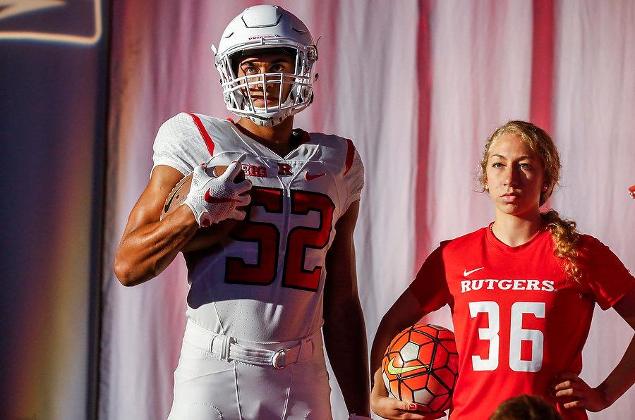
All I know is this look below is the least intimidating football uniform I have ever seen. Looks more fitting in a powderpuff league:

image.png
 
  • Like
Reactions: Bamm Bamm Rubble
I didn't love them via the initial pics, but the shots with the players wearing them on stage look better for some reason.
 
Didnt initially like not having Rutgers spelled out but I lover the block R in its place on front of jersey

Gets my stamp of approval
 
After I watched the video with a bunch of tools over talking branding... I hated this direction even more.

Yes, classic is the way to go... but the all white scheme just looks ridiculous and non-intimidating. In so many ways.

I pray Ash doesn't scrap the all black look. The kids love it and always brought their best game in them. It was always the jersey that was more difficult to get in stores. Fans (especially younger demo) love it.

Should be scarlet at home, black away. With white accents on both.

And yes... the knight head was poorly designed. Looks like he's staring down in shame. Way to go Nike!

black away?

you think this is the XFL or something?
 
  • Like
Reactions: Sir ScarletKnight
Unis are very solid and am a big fan of the new knight head. The old one was connected to the late 90's RU which we'd like everyone to forget. More importantly, not only is the new knight head a different look, it symbolizes the culture change that needs to happen. Love it.
 
Incorporate the new knighthead as a shoulder patch, add some "outlines" on the seams, and add some reflective material to where some of the heavier patching is IMO.


Not bad by any means, though.
 
Thanks for the still pics. Impossible to see the details in the video. I like the chainmail idea, but it's just so subtle, you'll never see it. I actually like the shape of the Flood-era numbers and wish they had kept the shape and size (just not the gray color).
 
Get off my lawn!

Sorry, I just don't get all worked up about new uniforms and breathless "uniform reveals". Because man. The appeal of Fashion Week lies solely in its ability to attract chicks.

These guys win 10 games, they can play in freakin' tutus, for all I care.
 
Chainmail....sooooooo lame...at least it is not armor scratches...
 
95% positive. I don't love the numerals, but it may be the '14' in the sample. The 52 looks better. At least they're not silver/gray and can be seen.
 
  • Like
Reactions: RUonBrain
Not bad. Better than the Power Rangers uniforms. Anyone noticed the bELieve sticker on the helmets?
 
I thought the numbers were too big at first. Then you look at PSU, OSU and UM and they're all the same size. So I'm glad we now look consistent with the other B1G teams.
 
  • Like
Reactions: ntlrock1
Show more screen caps from the right side of the stage. I watched the rvision broadcast. Though the new knight head is the secondary logo, it will be used alot more than the old secondary knight head logo. The wrestling singlet, golf polo, and other uniforms only show the new knight head. No Block R. I don't know how I feel about that.

Does Michigan even have a secondary logo?
 
ADVERTISEMENT
ADVERTISEMENT