

Colleges
- AAC
- ACC
- Big 12
- Big East
- Big Ten
- Pac-12
- SEC
- Atlantic 10
- Conference USA
- Independents
- Junior College
- Mountain West
- Sun Belt
- MAC
- More
- Navy
- UAB
- Tulsa
- UTSA
- Charlotte
- Florida Atlantic
- Temple
- Rice
- East Carolina
- USF
- SMU
- North Texas
- Tulane
- Memphis
- Miami
- Louisville
- Virginia
- Syracuse
- Wake Forest
- Duke
- Boston College
- Virginia Tech
- Georgia Tech
- Pittsburgh
- North Carolina
- North Carolina State
- Clemson
- Florida State
- Cincinnati
- BYU
- Houston
- Iowa State
- Kansas State
- Kansas
- Texas
- Oklahoma State
- TCU
- Texas Tech
- Baylor
- Oklahoma
- UCF
- West Virginia
- Wisconsin
- Penn State
- Ohio State
- Purdue
- Minnesota
- Iowa
- Nebraska
- Illinois
- Indiana
- Rutgers
- Michigan State
- Maryland
- Michigan
- Northwestern
- Arizona State
- Oregon State
- UCLA
- Colorado
- Stanford
- Oregon
- Arizona
- California
- Washington
- USC
- Utah
- Washington State
- Texas A&M
- Auburn
- Mississippi State
- Kentucky
- South Carolina
- Arkansas
- Florida
- Missouri
- Ole Miss
- Alabama
- LSU
- Georgia
- Vanderbilt
- Tennessee
- Louisiana Tech
- New Mexico State
- Middle Tennessee
- Western Kentucky
- UTEP
- Florida International University
High School
- West
- Midwest
- Northeast
- Southeast
- Other
- Alaska
- Arizona
- California
- Colorado
- Nevada
- New Mexico
- Northern California
- Oregon
- Southern California Preps
- Washington
- Edgy Tim
- Indiana
- Kansas
- Nebraska
- Iowa
- Michigan
- Minnesota
- Missouri
- Oklahoma Varsity
- Texas Basketball
- Texas
- Wisconsin
- Delaware
- Maryland
- New Jersey Basketball
- New Jersey
- New York City Basketball
- Ohio
- Pennsylvania
- Greater Cincinnati
- Virginia
- West Virginia Preps
ADVERTISEMENT
Install the app
How to install the app on iOS
Follow along with the video below to see how to install our site as a web app on your home screen.
Note: This feature may not be available in some browsers.
You are using an out of date browser. It may not display this or other websites correctly.
You should upgrade or use an alternative browser.
You should upgrade or use an alternative browser.
New uniforms released Monday 8/3
- Thread starter jersey07080
- Start date
- Status
- Not open for further replies.

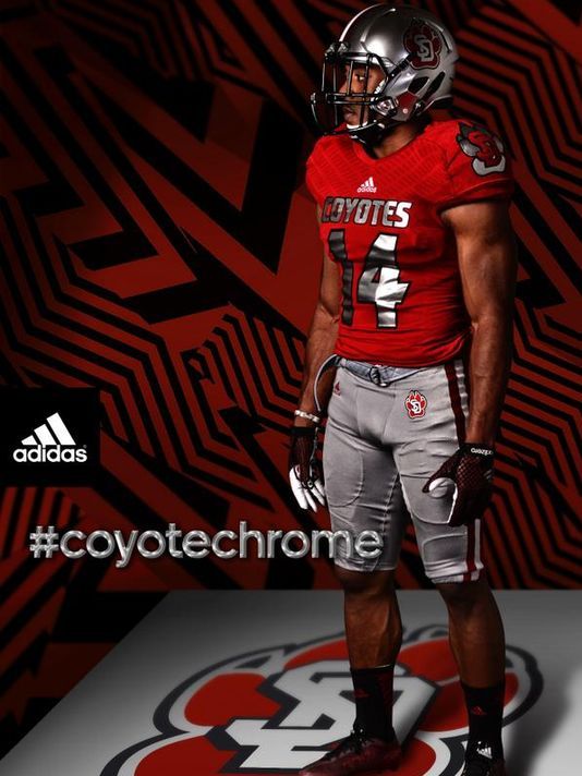
Nope, I have an inside source. Ready? Chrome uniforms. Salmon helmets. Boom.Salmon with chrome helmets!
Actually, I got it wrong. My buddy leaked an early image, sorry to spoil it early for you guys. Anyway, I love them!!!!! Image:
That is the most correct prediction.Posters will complain
Everyone should know by now the one thing I want to see.
Predictions?
They won't play in them this season.
Anything besides a red helmet with a Block R will be massive complaints. These “brand artists” today that work for these marketing firms, Nike and Adidas, and the athletics marketing department wouldn’t know a “brand” if you hit them in the face with it. The most ironic job ever, “re-branding” .. isn’t that a bit of an oxymoron. Just expect some “new, fresh” BS that is unrecognizable from anything that reminds you of Rutgers university.
I think it's back to something like our first adidas jerseys just with the new Primeknit. Maybe some tweaks. It won't quite be the classic Nike ones but it'll be close.
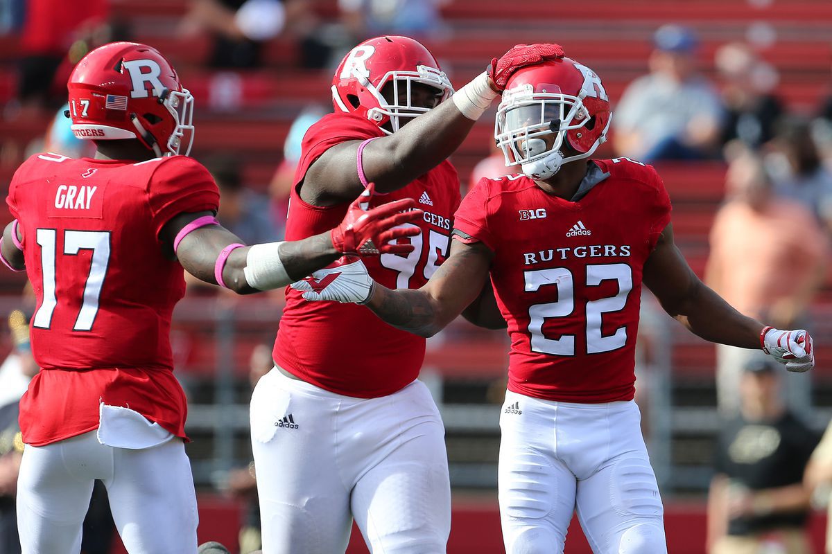
I better not see any f'ing chrome!!!Predictions?
+1Anything besides a red helmet with a Block R will be massive complaints. These “brand artists” today that work for these marketing firms, Nike and Adidas, and the athletics marketing department wouldn’t know a “brand” if you hit them in the face with it. The most ironic job ever, “re-branding” .. isn’t that a bit of an oxymoron. Just expect some “new, fresh” BS that is unrecognizable from anything that reminds you of Rutgers university.
The video they put out for the previous version was unintentionally hilarious. After watching it I thought to myself...do these people know anything about football or even their client, Rutgers?
Put some sort of stripe on the pants with the Block R on the thigh
White or red cleats, the black cleats don't look good
White or red cleats, the black cleats don't look good
Other than a change of font to the 2008 unis, looks good to me. This is as the classic Rutgers brand as you can get.I think it's back to something like our first adidas jerseys just with the new Primeknit. Maybe some tweaks. It won't quite be the classic Nike ones but it'll be close.
And everyone still on Nike's jock eventhough they treated Rutgers like crap the first time around. Hasnt Adidas been good to Rutgers?
Agree slight tweaks. Probably get rid of the "Rollerball" style number font and return to more block style numbers. As for shoulder stripe, I can take or leave. Hopefully not too much more drastic changes than that.
The entire athletics department uses that # font, which was created for us by Nike and for some reason we took it to Adidas. I'd be shocked if we changed that to a standard block # with the $ issues we have, but would love it.Agree slight tweaks. Probably get rid of the "Rollerball" style number font and return to more block style numbers. As for shoulder stripe, I can take or leave. Hopefully not too much more drastic changes than that.

Glad I scrolled down.. was just going to post a mask... as in.. they won' t need football unis. (I go back and forth on that).
My actual prediciton.. simple, readable, classic.. like 2006
And maybe a "woke" Black Uni.. why not? BLM patches... for the saying.. NOT the organization... ooh.. better yet.. Chop4Change patches
Last edited:
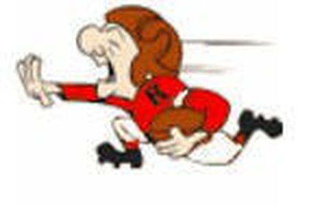
Rooting for the classic Mr. Magoo Rutgers look, seen here powering in the wrong direction for a safety

Hate the Chicago Bears round number font almost as much as this one now.Other than a change of font to the 2008 unis, looks good to me. This is as the classic Rutgers brand as you can get.
And everyone still on Nike's jock eventhough they treated Rutgers like crap the first time around. Hasnt Adidas been good to Rutgers?
If the only thing I get is a block numbers I could live with you that.
- Status
- Not open for further replies.
Similar threads
- Replies
- 3
- Views
- 479
- Replies
- 3
- Views
- 386
ADVERTISEMENT
ADVERTISEMENT