ADVERTISEMENT

POLL: Rutgers New Look Uniforms

How much do you like the new uniforms?


  • Total voters
    226
Sep 11, 2006
59,399
18,084
113
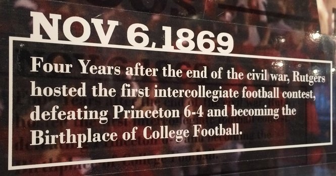
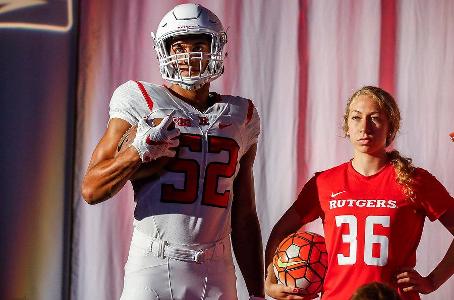
I am usually picky on the uniforms.. but I like what I see so far. Thoughtful, leaning conservative/traditional but definitely looking modern. That was a tough mark to hit and I think Nike hit it.

Now, my only concern is if the red will seem scarlet enough in sun, shade and stadium lights. That is TBD.

bf08f42.jpg
 
  • Like
Reactions: ruready07
they are okay. Kind of plain, but overall they are fine. I liked some things about the previous jerseys, but I understand the complaints about the numbers and other things.
 
I don't like the weird font on the new uniforms and I think the numbers should be a little bit smaller.
 
  • Like
Reactions: JQRU91
I do hope they have a 250th patch for this season and yes like above comments The block R is a font type how F'in stupid not to use the same font on the NUMBERS A$$ Hole artists need to justify their existence so much for "Tradition"???
 
  • Like
Reactions: 17Q66
I do hope they have a 250th patch for this season and yes like above comments The block R is a font type how F'in stupid not to use the same font on the NUMBERS A$$ Hole artists need to justify their existence so much for "Tradition"???

What makes you so certain there are numbers in the same font? The block R is a proprietary font design. I do not think there is an entire font set that goes with the Block R. We used to use the Chi Bears numbers with "RUTGERS" in the block R font type. If numbers of the Block R proprietary font type exist, they've never been used.

I agree with the poster above that I don't love some of the new numbers. THe 14 looks particularly bad, so I am surprised that is their "model." But overall, the look is great. I wonder what an 8 and 9 look like. I haven't seen any of the rounded numbers and wonder if they are round or squared off.
 
The more I think about it, the more it sucks. Now we're gonna be able to tell the players apart. Numbers on the uniform - what a stupid idea. That's why we have an announcer at the stadium!
 
about the numbers.. it looks like they match the overall look in that they echo the traditional Block R with the serifs but are rather modern overall. The numbers straddle the classic/modern just like the overall look does.
 
  • Like
Reactions: ruready07
Side note - the jerseys look 100x better with the B1G logo on them. Not saying that as a "it's great we're in the Big Ten" thing (although it is), but I mean the jerseys in the video look "plain" and empty kind of, but then seeing the other video with the B1G on them they look a lot better.
 
  • Like
Reactions: MikeRU09
What makes you so certain there are numbers in the same font? The block R is a proprietary font design. I do not think there is an entire font set that goes with the Block R. We used to use the Chi Bears numbers with "RUTGERS" in the block R font type. If numbers of the Block R proprietary font type exist, they've never been used.

There is. It was made by athletics specifically in the block R font. There are other fonts out there that are similar, block and collegiate-looking, but this one is specific to us. Not sure if there are numbers that go along with it, but I'm sure they could make them easily and could've been our number font. Oh well, we have that font now as the numbers. It's kind of similar with the little juts at the end of the lines, like on the 5, 2, and 4.
whiteA.png

whiteB.png

whiteC.png

Screen%2BShot%2B2016-04-26%2Bat%2B4.31.10%2BPM.png

whiteF.png

whiteG.png

whiteH.png

whiteI.png

whiteP.png

whiteR.png

whiteT.png
MAB_8556-S.jpg


Actually, it appears there are numbers that go with the font. This from the Hale Center:
16269918-standard.jpg


Some other letters
ecf72ea9b154181a266443f3690cd259.31992.jpeg
 
I'm not sure if I "like" the new uniforms as-is or only like the new uniforms in comparison to our last uniforms-- which were GOD AWFUL.

They look eerily similar to the Cleveland Browns getup's in my opinion. They should have never changed them in the first place.
 
  • Like
Reactions: MikeRU09
There are. You see them on our current practice jerseys and on 2009-11 game jerseys. Not the Bears numbers; different typeface.

and there's a font set that goes with the R; in fact, NIKE uses it in their promo video.

That is news to me. So you are saying the 2011 jerseys were our own font, not the Bears numbers??

Thats funny, because I always hated those jerseys because the number looked like they didnt belong. Guess it was just me.

EDIT: I see now that our numbers were serif, and the Bear aren't. I never noticed that before.


I actually like the new numbers a lot. The ONLY number I think I do not like is the 4, which they have used everywhere...it is the funkiest of all of them. The rest have a nice stylized serif.

 
  • Like
Reactions: MikeRU09
Looking at the differences between MikeRU09's mock up of the 2006 jerseys, and even the 2011 jerseys I posted above, you can really see how much more refined and polished the new ones are. I always thought that what we were missing was not so much more style elements, but the little things, like the vents and piping that the big time schools always seemed to have that we never did.

Check out a UGA jersey for example...very simple, traditional looking, but very polished.

 
Would rather the wrestling uniforms with a block R rather than the secondary logo. Although I really like the new secondary logo I do want it to replace the Block R. I as others have said would put the R on the white pants as well.
 
Love the new uniforms.
Traditional with a modern touch.
I vote for no secondary logo on anything football.
The block R is what Rutgers is now. That's what
the country can visualize as Rutgers.
Great color red.
 
Would rather the wrestling uniforms with a block R rather than the secondary logo. Although I really like the new secondary logo I do want it to replace the Block R. I as others have said would put the R on the white pants as well.

Alternate black singlet has that while the red while have the Block R. Those aren't all uniforms, in the pictures, by the way. Some are just wearing sports apparel stuff.
 
There is. It was made by athletics specifically in the block R font. There are other fonts out there that are similar, block and collegiate-looking, but this one is specific to us. Not sure if there are numbers that go along with it, but I'm sure they could make them easily and could've been our number font. Oh well, we have that font now as the numbers. It's kind of similar with the little juts at the end of the lines, like on the 5, 2, and 4.


This is correct. If you're at home and trying to design something with the "Block R font" the closest you're going to come is the typestyle named "Geometric Slabserif 712 Standard Extra Bold."
 
Try Google fonts Belgrano

The serifs have a chiseled look, otherwise they are about right I think.

Code:
<link href='https://fonts.googleapis.com/css?family=Belgrano' rel='stylesheet' type='text/css'>

RUTGERS
 
Last edited:
Our new unis are ok. We missed an opportunity to have a good classic update. Here's what would've made them better IMO:

1. More black accents on the unis,
2. Sword stripes on red & white helmets,
3. Block #s,
4. #s on shoulders,
5. Keep battlescarred helmets & use all of them,
6. Multicolor stripes on sleeves.
 
179 votes: the verdict is glaringly obvious.
Agreed.

We like them.

We really, really like them.

BUT.. throw away the over-stylized and processed knight helmet. When will designers ever learn? When you brag about how you twisted this thing into a diamond-shape, it ceases to be what it was.. a dang knight's helmet.
 
Last edited:
The B1G is kind of an old school football conference. I think your uniforms fit in w the rest of the conference. More about tradition then flash like in other conferences.
 
Maybe I missed the discussion but are they going to put the player's name on the back of the jersey or is everyone going to have RUTGERS as shown in the photos? If the RUTGERS is just a place holder for the player's name then what font are they going to use? Block R font?
 
ADVERTISEMENT

Latest posts

ADVERTISEMENT