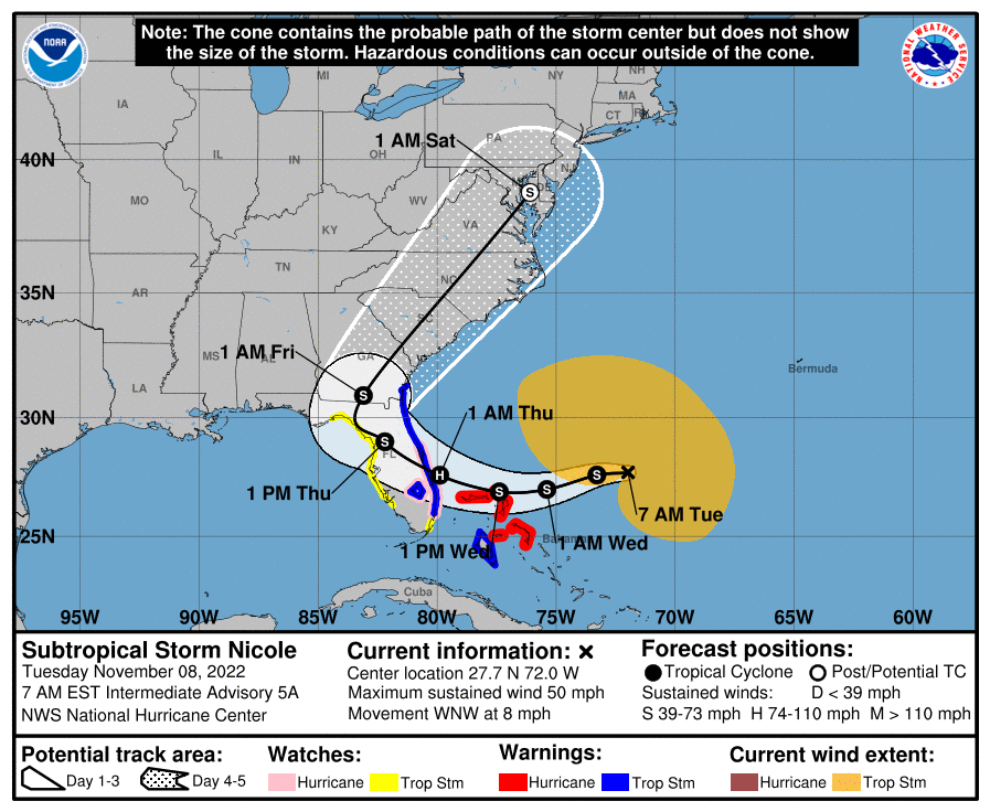
It's a great topic, as communicating risk probability/impact in the face of uncertainty, accurately, has been the subject of much discussion over the past few years for tropical systems by many (incliuding me and it applies to weather, in general). The linked article below does a nice job of capturing many of the issues and concerns. Probably the biggest issue is that the "cone" is based on a roughly 2 in 3 probability that the track will be within the cone at every time step (12-24 hour increments), based on historical accuracy of the model consensus that the NHC calculates - which obviously means that the track, on average, has a 1 in 3 chance of being outside the cone.This is irrelevant to the precise topic, but I think maps like the one above -- showing the cone within which the center may move -- should be dumped. My understanding is that the evidence shows that people do not understand them. People think that if they live outside the cone, they have no worries. I realize that the map clearly says that hazardous conditions can occur outside the cone, but that message doesn't get through. It would be better, IMHO, to have a map that shows all of the area with a significant chance of being affected by the storm, and to differentiate within that map by probabilities (so that, for instance, Pittsburgh is shown as having a lower probability of being affected by Philadelphia.) But what do I know.
Personally, I think the cone was a great advance 20+ years ago and I wouldn't scrap it, but I'd look to improve it. One change I've advocated for is labelling the outer cone lines to explicitly note that the center has a 2 in 3 chance of remaining within that cone, plus adding a 2nd cone (with a different color) showing where the center is maybe 90% likely to remain inside the cone, so that people see how much further outside the main cone the track might travel. I'd also love to see the little S's and H's at each time point actually be S1, S2, and H1 through H5, denoting forecast winds. For example, H1 would be for a cat 1 hurricane with 74-95 mph winds and I'd include that wind range right under the text showing the time stamp; I'd also split tropical storm into 2 levels, 39-55 mph as S1 and 56-73 mph as S2.
The article also shows well how the historical accuracy might not always be the best way to go for the cone. For example, for Ian, the cone should have been larger, given the bifurcation in model outcomes (with the Euro/UK showing a more southerly landfall near Ft. Myers, while the GFS and other models showed a landfall north of Tampa), which meant it was more likely than usual that the track would be outside the cone (and it was). Also, the angle of approach for Ian was the worst case, where the storm was forecast to head close to parallel to the FL Gulf coast, meaning small changes in track would lead to very large changes in landfall, as we eventually saw.
One other thing that the cone graphic doesn't convey well, as you noted, is the risk of major impacts outside the cone. Perhaps the best example of this was Ian, where Naples, FL was not within the cone, yet was subject to catastrophic storm surge from the hurricane, given that the right side of the storm is always strongest (and the cone is symmetrical), especially with regard to surge. Maybe the cone/track map should also show where storm surge warnings are, especially when outside of the cone track.
https://yaleclimateconnections.org/2022/10/building-a-better-hurricane-cone-of-uncertainty/